
7 Ways Designers and Homeowners Use Maps to Bring Interiors to Life
Maps are far more than navigational tools or nostalgic curiosities. In thoughtful interiors, they function as visual anchors, personal narratives, and design signals - bringing a sense of place, history and emotional resonance into a space.
Designers and homeowners alike are embracing cartographic art not simply for decoration, but for the unique ways it activates interiors.
Below, we explore seven real‑world approaches to using maps in interior design, each supported by observations and examples from reputable design sources.
1. Creating Meaningful, Personal Wall Art
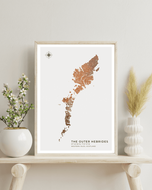
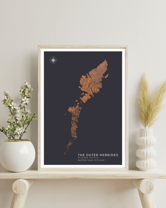
Designers frequently use maps to express personal connection - whether it’s a hometown, favourite travel destination or an area of special significance. As interior‑design coverage in House & Garden notes, many people choose maps that reflect places they have lived or visited, bringing a sentimental theme into their interiors.
This storytelling quality makes maps especially effective in living rooms and bedrooms, where they act as pieces that are both beautiful and deeply personal.
2. Adding Graphic Impact with Scale and Detail
Large‑format maps - from oversized antique charts to expansive murals - offer an immediate visual impact that few other artworks can match. Homes & Gardens highlights designers using wall‑scale maps to make a bold statement, whether as a feature wall or part of a balanced gallery arrangement.
The intricate lines, contours and historic typography give a room depth and texture that often transcends standard photo or print art.
3. Mixing Maps with Gallery Walls for Visual Rhythm
Interior professionals frequently incorporate maps into gallery walls alongside paintings, photographs and prints. The varied scale, pattern and historical references of maps complement other artworks, creating a layered composition that feels curated rather than decorative.
This idea appears across sources such as Homes & Gardens, which advocates mixing map art with other visual pieces to bring diversity and layered narrative to a gallery layout.
4. Transforming Ordinary Surfaces into Feature Points
Maps aren’t limited to framed prints. Designers have experimented with them in unexpected applications - for example, custom wall murals, bespoke wallpaper panels or even as kitchen splashbacks. Houzz UK highlights creative ways to incorporate old maps as architectural features, such as using them on walls, headboards or even functional surfaces.
This approach turns a thoughtful design element into a defining spatial moment.
5. Bringing Nostalgia and History into Contemporary Interiors
As the printed map becomes more nostalgic in a digital age, its presence introduces warmth and historical reference into modern schemes. Houzz UK directly observes that maps - especially vintage ones - carry a textural and historical charm that can feel comforting and decorative in domestic spaces.
This nostalgic quality works particularly well in classic or heritage interiors, where the map’s patina and age lend authenticity and visual richness.
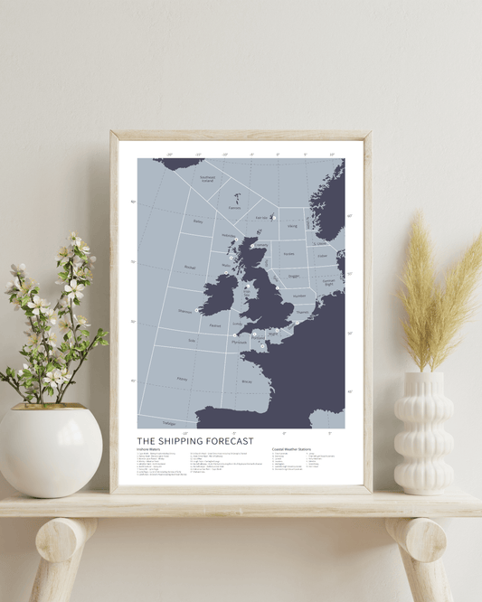
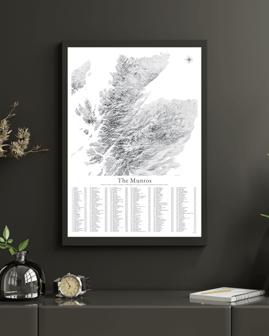
6. Enhancing Educational and Interactive Spaces
Maps also find purposeful use in rooms beyond the purely aesthetic. In studies, children’s rooms or creative workspaces, large world maps or detailed regional charts become interactive - encouraging discovery, learning and conversation. This practical and playful use is widely noted across interior literature, from framed school charts to map‑inspired murals.
Such design choices can subtly stimulate curiosity and engagement, making a room feel thoughtful and inviting.
7. Expressing Global Perspective and Aesthetic Sophistication
Because maps are inherently global and conceptual, they often signal a worldly worldview. Their presence in a space - whether vintage, contemporary, monochrome or richly hued - can communicate a sophisticated design sensibility. This aligns with wider design commentary that maps can contribute to a highly personal, visually impactful interior design scheme, combining art, history and narrative. Mapelio offers a wider range of personalised maps which suit all budgets and styles.
Unlike trend‑based art, maps carry both visual richness and cultural depth.
How Designers Think About Style, Material and Placement
When designers refer to maps as interior elements, a few practical themes recur in credible design sources:
- Framing and finish matter: A well‑framed map, whether antique in a refined moulding or modern in a minimalist frame, sets the tone for its setting.
- Scale guides function: Large formats become focal points, while smaller regional maps complement other art in vignette arrangements.
- Colour and context: Choosing maps that relate to a room’s palette allows them to integrate more harmoniously, creating visual balance.
Final thoughts
The enduring appeal of maps in interiors lies in their dual nature. They are at once decorative and meaningful, historic and contemporary, graphic and narrative. Designers and homeowners choose them not just for their visual appeal, but for the stories they tell and the emotional resonance they bring to a space.